Views are essentially what the user sees on the screen to interact with the application.
Most of the information presented in this application is shown as a Master-Detail structure with a list of items on the top and the details of the selected item on the bottom. The details of an item may be a group of properties describing the item (i.e. Customer details) or a list of items related to the selected item (i.e. Customer orders).
The following image shows a Master-Details view in this application.
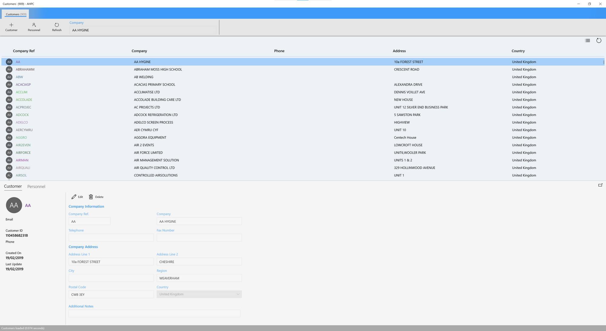
As you can see, the principal View is divided in two sections: A list with the customers of the app at the top, and the detail of the customer selected at the bottom. This is the XAML markup for that view:
<!--Customers-->
<Grid Grid.RowSpan="{x:Bind GetRowSpan(ViewModel.CustomerList.IsMultipleSelection), Mode=OneWay}">
<controls:Section Header="{x:Bind ViewModel.CustomerList.Title, Mode=OneWay}"
HeaderTemplate="{StaticResource ListHeaderTemplate}"
HeaderButtonGlyph=""
HeaderButtonClick="OpenInNewView"
IsButtonVisible="{x:Bind ViewModel.IsMainView}">
<views:CustomersList ViewModel="{x:Bind ViewModel.CustomerList}" />
</controls:Section>
</Grid>
<!--Details-->
<Grid Grid.Row="1"
BorderBrush="LightGray"
BorderThickness="0,1,0,0"
Visibility="{x:Bind ViewModel.CustomerList.IsMultipleSelection, Mode=OneWay, Converter={StaticResource InverseBoolToVisibilityConverter}}">
<controls:Section IsEnabled="{x:Bind ViewModel.CustomerDetails.IsEnabled, Mode=OneWay}"
HeaderButtonGlyph=""
HeaderButtonClick="OpenDetailsInNewView"
Background="{StaticResource DetailsViewBackgroundColor}"
Visibility="{x:Bind ViewModel.CustomerDetails.IsDataAvailable, Mode=OneWay}">
<Pivot x:Name="pivot">
<PivotItem Header="Customer">
<views:CustomersDetails ViewModel="{x:Bind ViewModel.CustomerDetails}" />
</PivotItem>
<PivotItem Header="Orders">
<views:CustomersOrders ViewModel="{x:Bind ViewModel.CustomerOrders}" />
</PivotItem>
</Pivot>
</controls:Section>
<!--Empty Details-->
<controls:Section Header="No item selected"
Visibility="{x:Bind ViewModel.CustomerDetails.IsDataUnavailable, Mode=OneWay}" />
</Grid>
We can highlight two principal sections:
- The list of customers:
<views:CustomersList ViewModel="{x:Bind ViewModel.CustomerList}" />
- The detail of the customer selected:
<views:CustomersDetails ViewModel="{x:Bind ViewModel.CustomerDetails}" />
Lists
The lists in the App are defined in XAML as UserControls to be integrated in a principal View, and the ViewModel associated to this control are of the type GenericListViewModel<TModel>, and in the particular case of the customers:
public class CustomerListViewModel : <CustomerModel>
To know more about the GenericListViewModel check this section.
DataList control
The Datalist control is a generic UserControl that we'll use in all of our lists in the App. It is defined like so:
<UserControl
    x:Class="App.Controls.DataList"
    xmlns="http://schemas.microsoft.com/winfx/2006/xaml/presentation"
    xmlns:x="http://schemas.microsoft.com/winfx/2006/xaml"
    xmlns:d="http://schemas.microsoft.com/expression/blend/2008"
    xmlns:mc="http://schemas.openxmlformats.org/markup-compatibility/2006"
    xmlns:controls="using:App.Controls"
    mc:Ignorable="d" d:DesignWidth="800" d:DesignHeight="400">

    <Grid>
        <Grid.RowDefinitions>
            <RowDefinition Height="Auto"/>
            <RowDefinition Height="Auto"/>
            <RowDefinition Height="*"/>
            <!--<RowDefinition Height="28"/>-->
        </Grid.RowDefinitions>

        <!--Toolbar-->
        <controls:ListToolbar
            DefaultCommands="{x:Bind DefaultCommands, Mode=OneWay}"
            NewLabel="{x:Bind NewLabel, Mode=OneWay}"
            Query="{x:Bind Query, Mode=TwoWay}"
            QuerySubmitted="OnQuerySubmitted"
            ToolbarMode="{x:Bind ToolbarMode, Mode=OneWay}"
            ButtonClick="OnToolbarClick" />

        <!--Header-->
        <ContentControl Grid.Row="1"
                        ContentTemplate="{x:Bind HeaderTemplate}"
                        HorizontalContentAlignment="Stretch" />

        <!--List Content-->
        <Grid Grid.Row="2">
            <ListView x:Name="listview"
                  DoubleTapped="OnDoubleTapped"
                  ItemsSource="{x:Bind ItemsSource, Mode=OneWay}"
                  ItemTemplate="{x:Bind ItemTemplate}"
                  ItemContainerStyle="{StaticResource RowItemStyle}"
                  SelectedItem="{x:Bind SelectedItem, Mode=TwoWay}"
                  SelectionMode="{x:Bind SelectionMode, Mode=OneWay}"
                  SelectionChanged="OnSelectionChanged"
                  Visibility="{x:Bind IsDataAvailable, Mode=OneWay}" />
            <TextBlock Margin="6" Text="{x:Bind DataUnavailableMessage, Mode=OneWay}" Visibility="{x:Bind IsDataUnavailable, Mode=OneWay}"/>
        </Grid>
    </Grid>
</UserControl>
There are 3 parts to define in every list:
- The toolbar actions over the list, represented by the UserControl
ListToolbar. - The header of the list.
- And finally a ListView to display the data.
We can see how it's being used in the UserControl CustomersList.xaml:
<UserControl
    x:Class="App.Views.CustomersList"
    xmlns="http://schemas.microsoft.com/winfx/2006/xaml/presentation"
    xmlns:x="http://schemas.microsoft.com/winfx/2006/xaml"
    xmlns:d="http://schemas.microsoft.com/expression/blend/2008"
    xmlns:mc="http://schemas.openxmlformats.org/markup-compatibility/2006"
    xmlns:models="using:App.Models"
    xmlns:controls="using:App.Controls"
    mc:Ignorable="d" d:DesignWidth="800" d:DesignHeight="400">

    <UserControl.Resources>
        <DataTemplate x:Key="HeaderTemplate">
            <Grid BorderBrush="LightGray" BorderThickness="0,0,0,1">
                <Grid.ColumnDefinitions>
                    <ColumnDefinition Width="40"/>
                    <ColumnDefinition Width="8*"/>
                    <ColumnDefinition Width="10*"/>
                    <ColumnDefinition Width="12*"/>
                    <ColumnDefinition Width="10*"/>
                    <ColumnDefinition Width="10*"/>
                    <ColumnDefinition Width="8*"/>
                </Grid.ColumnDefinitions>
                <TextBlock Grid.Column="1" Text="Customer ID" Style="{StaticResource ColumnHeaderStyle}" />
                <TextBlock Grid.Column="2" Text="Name" Style="{StaticResource ColumnHeaderStyle}" />
                <TextBlock Grid.Column="3" Text="eMail" Style="{StaticResource ColumnHeaderStyle}" />
                <TextBlock Grid.Column="4" Text="Phone" Style="{StaticResource ColumnHeaderStyle}" />
                <TextBlock Grid.Column="5" Text="Address" Style="{StaticResource ColumnHeaderStyle}" />
                <TextBlock Grid.Column="6" Text="Country" Style="{StaticResource ColumnHeaderStyle}" />
            </Grid>
        </DataTemplate>

        <DataTemplate x:Key="ItemTemplate" x:DataType="models:CustomerModel">
            <Grid BorderThickness="0,0,0,0" BorderBrush="LightGray" Height="32">
                <Grid Visibility="{x:Bind IsEmpty, Converter={StaticResource InverseBoolToVisibilityConverter}}">
                    <Grid.ColumnDefinitions>
                        <ColumnDefinition Width="40"/>
                        <ColumnDefinition Width="8*"/>
                        <ColumnDefinition Width="10*"/>
                        <ColumnDefinition Width="12*"/>
                        <ColumnDefinition Width="10*"/>
                        <ColumnDefinition Width="10*"/>
                        <ColumnDefinition Width="8*"/>
                    </Grid.ColumnDefinitions>
                    <Border Grid.Column="0" Margin="1" Padding="1">
                        <PersonPicture ProfilePicture="{x:Bind ThumbnailSource, Mode=OneWay, Converter={StaticResource ObjectToImageConverter}}" Width="28" Height="28" x:Phase="1" />
                    </Border>
                    <TextBlock Grid.Column="1" Text="{x:Bind CustomerID}" Style="{StaticResource ColumnValueStyle}" />
                    <TextBlock Grid.Column="2" Text="{x:Bind FullName, Mode=OneWay}" Style="{StaticResource ColumnValueStyle}" />
                    <TextBlock Grid.Column="3" Text="{x:Bind EmailAddress, Mode=OneWay}" Style="{StaticResource ColumnValueStyle}" />
                    <TextBlock Grid.Column="4" Text="{x:Bind Phone, Mode=OneWay}" Style="{StaticResource ColumnValueStyle}" />
                    <TextBlock Grid.Column="5" Text="{x:Bind AddressLine1, Mode=OneWay}" Style="{StaticResource ColumnValueStyle}" />
                    <TextBlock Grid.Column="6" Text="{x:Bind CountryName, Mode=OneWay}" Style="{StaticResource ColumnValueStyle}" />
                </Grid>
            </Grid>
        </DataTemplate>
    </UserControl.Resources>

    <controls:DataList ItemsSource="{x:Bind ViewModel.Items, Mode=OneWay}"
                       ItemSecondaryActionInvokedCommand="{x:Bind ViewModel.OpenInNewViewCommand}"
                       NewLabel="New Customer"
                       SelectedItem="{x:Bind ViewModel.SelectedItem, Mode=TwoWay}"
                       HeaderTemplate="{StaticResource HeaderTemplate}"
                       ItemTemplate="{StaticResource ItemTemplate}"
                       IsMultipleSelection="{x:Bind ViewModel.IsMultipleSelection, Mode=TwoWay}"
                       ItemsCount="{x:Bind ViewModel.ItemsCount, Mode=OneWay}"
                       NewCommand="{x:Bind ViewModel.NewCommand}"
                       RefreshCommand="{x:Bind ViewModel.RefreshCommand}"
                       Query="{x:Bind ViewModel.Query, Mode=TwoWay}"
                       QuerySubmittedCommand="{x:Bind ViewModel.RefreshCommand}"
                       StartSelectionCommand="{x:Bind ViewModel.StartSelectionCommand}"
                       CancelSelectionCommand="{x:Bind ViewModel.CancelSelectionCommand}"
                       SelectItemsCommand="{x:Bind ViewModel.SelectItemsCommand}"
                       DeselectItemsCommand="{x:Bind ViewModel.DeselectItemsCommand}"
                       SelectRangesCommand="{x:Bind ViewModel.SelectRangesCommand}"
                       DeleteCommand="{x:Bind ViewModel.DeleteSelectionCommand}" />
</UserControl>
This is just 2 ItemTemplates, one for the header of the list and the template for the items, and the DataList control. Please note how the all data and oprations are binded to the control.
Detail
Similar to the list control, we will have a common control to display the details of a specific Domain Model, and in this case, the ViewModel associated to these controls will be the GenericDetailsViewModel<TModel>, and again in the case of the customer details will be:
public class CustomerDetailsViewModel : GenericDetailsViewModel<CustomerModel>
More about the GenericDetailsViewModel check this section.
Details control
The Details control it will be used to display the detail of a Domain Model
<UserControl
    x:Class="App.Controls.Details"
    xmlns="http://schemas.microsoft.com/winfx/2006/xaml/presentation"
    xmlns:x="http://schemas.microsoft.com/winfx/2006/xaml"
    xmlns:d="http://schemas.microsoft.com/expression/blend/2008"
    xmlns:mc="http://schemas.openxmlformats.org/markup-compatibility/2006"
    xmlns:controls="using:App.Controls"
    mc:Ignorable="d" d:DesignWidth="800" d:DesignHeight="400">

    <Grid>
        <Grid.RowDefinitions>
            <RowDefinition Height="Auto"/>
            <RowDefinition Height="*"/>
        </Grid.RowDefinitions>
        <controls:DetailToolbar ToolbarMode="{x:Bind ToolbarMode, Mode=OneWay}" DefaultCommands="{x:Bind DefaultCommands, Mode=OneWay}" ButtonClick="OnToolbarClick" />
        <ScrollViewer Grid.Row="1" VerticalScrollBarVisibility="Auto">
            <ContentControl x:Name="container" Content="{x:Bind DetailsContent}" ContentTemplate="{x:Bind DetailsTemplate}" HorizontalContentAlignment="Stretch" VerticalContentAlignment="Stretch" />
        </ScrollViewer>
    </Grid>
</UserControl>
This control is defined by:
- A toolbar with the operations over the Domain Model details.
- And the details, which require the
Content, i.e. the ViewModel, and aDetailsTemplate, which is the form to display the information.
An example of how it's used in the CustomerDetails.xaml control:
<UserControl
    x:Class="App.Views.CustomersDetails"
    xmlns="http://schemas.microsoft.com/winfx/2006/xaml/presentation"
    xmlns:x="http://schemas.microsoft.com/winfx/2006/xaml"
    xmlns:d="http://schemas.microsoft.com/expression/blend/2008"
    xmlns:mc="http://schemas.openxmlformats.org/markup-compatibility/2006"
    xmlns:controls="using:App.Controls"
    xmlns:views="using:App.Views"
    xmlns:viewmodels="using:App.ViewModels"
    mc:Ignorable="d" d:DesignWidth="800" d:DesignHeight="400">

    <UserControl.Resources>
        <DataTemplate x:Key="DetailsTemplate" x:DataType="viewmodels:CustomerDetailsViewModel">
            <controls:FluidGrid Margin="0,12,0,0" Columns="2" ColumnSpacing="12" RowSpacing="12">
                <controls:LabelTextBox Label="First Name" Text="{x:Bind EditableItem.FirstName, Mode=TwoWay}" />
                <controls:LabelTextBox Label="Last Name" Text="{x:Bind EditableItem.LastName, Mode=TwoWay}" />
                <controls:FluidGrid Columns="2" ColumnSpacing="6" RowSpacing="12" MinColumnWidth="60">
                    <controls:LabelTextBox Label="Middle Name" Text="{x:Bind EditableItem.MiddleName, Mode=TwoWay}" />
                    <controls:LabelTextBox Label="Sufix" Text="{x:Bind EditableItem.Suffix, Mode=TwoWay}" />
                </controls:FluidGrid>
                <controls:LabelTextBox Label="EMail Address" Text="{x:Bind EditableItem.EmailAddress, Mode=TwoWay}" />
                <controls:LabelTextBox Label="Phone" Text="{x:Bind EditableItem.Phone, Mode=TwoWay}" />
                <controls:LabelTextBox Label="Address" Text="{x:Bind EditableItem.AddressLine1, Mode=TwoWay}" />
                <controls:LabelTextBox Label="Postal Code" Text="{x:Bind EditableItem.PostalCode, Mode=TwoWay}" />
                <controls:LabelTextBox Label="City" Text="{x:Bind EditableItem.City, Mode=TwoWay}" />
                <controls:LabelTextBox Label="Region" Text="{x:Bind EditableItem.Region, Mode=TwoWay}" />
                <controls:LabelComboBox Label="Country" ItemsSource="{x:Bind LookupTables.CountryCodes}"
                                        SelectedValue="{x:Bind EditableItem.CountryCode, Mode=TwoWay}"
                                        SelectedValuePath="CountryCodeID" DisplayMemberPath="Name" />
            </controls:FluidGrid>
        </DataTemplate>
    </UserControl.Resources>

    <Grid ColumnSpacing="6"
          Visibility="{x:Bind ViewModel.Item.IsEmpty, Mode=OneWay, Converter={StaticResource InverseBoolToVisibilityConverter}}">
        <Grid.ColumnDefinitions>
            <ColumnDefinition Width="260"/>
            <ColumnDefinition Width="*"/>
        </Grid.ColumnDefinitions>

        <Grid BorderThickness="0,0,1,0" BorderBrush="LightGray">
            <views:CustomersCard Margin="6,12" ViewModel="{x:Bind ViewModel}" Item="{x:Bind ViewModel.Item, Mode=OneWay}" />
        </Grid>

        <controls:Details x:Name="details" Grid.Column="1" Margin="6,0,0,0"
                          DetailsContent="{x:Bind ViewModel}"
                          DetailsTemplate="{StaticResource DetailsTemplate}"
                          IsEditMode="{x:Bind ViewModel.IsEditMode, Mode=OneWay}"
                          EditCommand="{x:Bind ViewModel.EditCommand}"
                          DeleteCommand="{x:Bind ViewModel.DeleteCommand}"
                          SaveCommand="{x:Bind ViewModel.SaveCommand}"
                          CancelCommand="{x:Bind ViewModel.CancelCommand}" />
    </Grid>
</UserControl>
Which is just a template representing the form with the Customer info, and the Details control with all the Data Binding and Commands.